How to Create a Stunning Glassmorphism Effect with Pure CSS
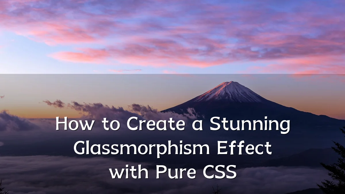
Recent Trends in Visual Design
Over the past few development cycles, interface designers have increasingly gravitated toward layered, translucent aesthetics. Glassmorphism—a style that mimics frosted glass through backdrop blur, semi-transparent backgrounds, and subtle shadows—has emerged as a prominent trend in dashboards, landing pages, and mobile applications. Its rise coincides with broader shifts toward neumorphism and minimalism, but glassmorphism distinguishes itself by prioritizing depth and context without sacrificing accessibility.

Background of the Technique
The effect relies on three core CSS properties: background with a semi-transparent color, backdrop-filter for the blur effect, and a soft box-shadow to simulate light refraction. Originally popularized by interface examples in Dribbble and Behance around 2020–2021, the technique became widely usable as browser support for backdrop-filter improved. Pure CSS implementation avoids JavaScript overhead, making it suitable for performance-sensitive projects.

- Core CSS properties:
backdrop-filter: blur(),background:with alpha transparency,border-radiusfor rounded edges, and layered shadows. - Browser support: Modern Chrome, Firefox, Safari, and Edge support
backdrop-filter; Firefox requireslayout.css.backdrop-filter.enabledflag in older versions. - Accessibility considerations: Low-contrast text and overlapping elements can reduce readability. Additional background opacity or a subtle text-shadow may be needed.
User and Developer Concerns
While visually appealing, glassmorphism presents practical challenges. Performance overhead from backdrop-filter can cause lag on lower-end devices, especially with large or multiple blurred layers. Developers also face issues with overlapping elements—content placed behind the glass card may be partially obscured, requiring careful z-index management. Accessibility audits frequently flag insufficient color contrast when semi-transparent backgrounds overlay busy images.
- Performance: Use
will-change: transformsparingly; test on mid-range devices. - Layering: Ensure text and interactive elements have a solid or sufficiently opaque background behind them.
- Fallback: Provide a nearly opaque background for browsers that do not support
backdrop-filter.
Likely Impact on Design Patterns
Adopting pure CSS glassmorphism encourages modular, reusable component libraries. Design systems can define a single glass mixin or utility class, reducing styling duplication. The effect is particularly effective for cards, modal overlays, and navigation bars where visual hierarchy is enhanced by transparent layering. However, widespread use may flatten visual distinction between interactive and decorative elements if not paired with clear affordances like hover effects or motion.
In news and editorial contexts (such as this article), glassmorphism can frame data callouts or quote blocks without overwhelming the content. Practical ranges for blur—between 8px and 20px—balance readability with the desired aesthetic.
What to Watch Next
Keep an eye on upcoming CSS features that may complement or replace glassmorphism: @layer for better cascade control, color-mix() for dynamic transparency, and the backdrop-filter improvements in CSS Filter Effects Module Level 2. The community is also exploring animated glassmorphism—blur intensity that shifts on scroll or hover—which could introduce new performance considerations. As browser APIs mature, pure CSS effects will continue to narrow the gap between static prototypes and production-ready interfaces.